
Accessibility & Insights
Introduction
Web accessibility, or eAccessibility, is the inclusive practice of ensuring there are no barriers that prevent interaction with, or access to, websites on the World Wide Web by people with physical disabilities, situational disabilities, and socioeconomic restrictions on bandwidth and speed. - Wikipedia
26% of adults in the United States have some disability. When thinking about the design and functionality of a website, it's crucial to consider the accessibility and inclusiveness to allow any user to utilize your products and services. Fortunately, many individuals and organizations have made it their top priority to develop and share their accessibility practices. The team on the Insights platform has been working to rebuild with accessibility at the forefront of our design.
Color and Contrast
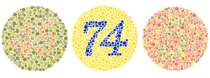
One of the easiest practices to implement is thoughtful color and contrast in your designs. Color is a great way to set personality and attract attention, but it can also be a major pitfall in accessibility. There are around 300 million people in the world with some variation or severity of color blindness which affects how they perceive color and hues and further, how they perceive the content on a webpage.


Insights is built with a simple, clean design, which makes things easy to read. We use contrasting colors as much as possible, ensure that things have enough space to breathe and allow the user to differentiate blocks or sections. Our code is built using a combination of component-specific SCSS and variables for global typography. Even as I write this, I discovered that we have a text color that would fail a contrast test. The good news is that all we have to do is work with the design team to find a new color and update the variable. Since we use that text color across the app, having it be a global variable protects us from inconsistencies and contrast issues elsewhere. It's as simple as changing the color hex and passing the required contrast ratio to get the entire site up to standard.

You’ll be looking for a contrast ratio of at least 4.5:1. This is the minimum required by the WCAG. If you have large text (18pt and larger, or 14pt and larger if it’s bold), that ratio changes to 3:1. There are plenty of online tools you can use to figure out if your website has contrast or color issues, but I like to use the WCAG Contrast checker extension. It's easy, free, and will let you change the level of conformance, and the best part is that it will let you change the color in the extension to find a passing contrast! Then you can copy and paste the new color hex into your design document or code component, and you’re now one step closer to being accessible. Some accessibility extensions will even recommend a similar color, so you don't have to find it yourself. Very helpful for providing information to the design team.
Sources: webAIM: Contrast and Color Accessibility
Screen Readers
If you’ve never tried to navigate through a website using a screen reader, I strongly recommend trying it at least once, especially if you had a hand in designing or developing said website. Try it blindfolded.

I tried it on Insights before, and it was… not great. What normally took me 2 minutes to successfully do without a blindfold took me over 30 minutes with a blindfold, and that doesn't include all the times I had to start over because I got stuck in a loop or completely lost. If I didn't know Insights, it would have taken me much longer to do anything substantial.
Screen readers and other assistive technology assist blind or visually impaired users in reading and navigating a website using audio, a keyboard, a braille display, or a combination of these. Still, they only work when a website is properly configured. This is where it takes a bit more effort from the developer side. Interactive elements need a role, a name, or a value for assistive technology to navigate and correctly describe the component. If your element isn’t what it’s labeled, for example, a hyperlink that acts like a button, you need to give it a role attribute (i.e., role=’button’) to tell the screen reader, “Hey! I know this looks like a hyperlink, but it's actually behaving like a button!” If you have a button that is just an icon, you’ll use attribute aria-label, so the screen reader knows what to call the button to the user; otherwise, it may just say “button,” and that's not very helpful.

Something else to consider is flow and blocks. We do our best to build Insights with a flow. This way, as a user navigates through assistive technology, they aren't bouncing around the page and getting lost. Start from the top and work across and down. You should be able to access everything using your Tab button. If you can't, likely a screen reader can’t either. If you want to test this without a screen reader, you can get the Accessibility Insights for Web extension. You can test many of your accessibility problems using this, including Tab stops. Another issue I found while writing this was we don’t utilize enough bypass blocks in Insights. These allow users to “skip” to the main content instead of tabbing through every element of our navigation components. A few ways to tackle this include adding a link to the top of the page that goes directly to the main content area, using Landmark roles, or grouping blocks of repeated material using semantic HTML.
Sources: AFB: Screen readers, W3Schools: Accessibility Role, Name & Value
Semantic HTML

I mentioned before how Insights is being designed with flow in mind, and one of the core pieces of that process is utilizing semantic elements in HTML. From a glance, you can see the clarity and organization it brings to a page. It also creates a cleaner coding environment. You can easily see where a header ends, and the main content begins. Instead of different programmers writing a header as <div className=”header”> or <div id=”header”>, it's simply and consistently <header>. Plus, there are around 100 elements, so you’ll definitely find one that fits your needs.
We try to avoid using <div> or <span> in Insights unless it's a simple component within a section. But for all our headers, we use header tags, such as <h1> and so on; for our lists, we use <li>'s contained inside <ul> elements. Another handy thing about using semantic HTML is that it makes your CSS much easier to manage. If you have <div> tags everywhere, it will be hard to discern what div needs to be styled and where they are. You have to depend on classNames or IDs, which can get messy and conflict very quickly. If you’ve broken your component down into semantic elements, you can specifically address those without using classnames that can easily get out of sync or overwritten.
Using semantic elements also helps screen readers navigate webpages, and it's easy to identify what information is contained. It's always a good idea to ask yourself, “Is there an element that best fits the data I'm trying to display,” and most likely, you’ll find one that fits the bill.
Sources: Semantics, HTML Semantic Elements
Closing


Insights has come a long way from the wild west of startup development, from the updated design to the newly organized repository system. We’re no longer dependent on clashing classNames and stacks and stacks of div elements. We’re more concerned with the flow and flexibility of keyboard usage and ensuring our data presentation is readable for any user. It’s not perfect, but we’ve built a solid foundation to improve our platform and have a mindful team while developing. I'll leave you with a quote I use frequently and enjoy, and I hope you will too.
“Accessibility is not just a practice, it’s a culture and a mindset.” - IBM